But go aloft, to say 5000-10,000 ft, and major temperatures declines will occur (5-15F).
So why are fronts so wimpy at low levels around here? The answer is below.
Here is the forecast map for 10 AM tomorrow at 700 hPa (about 10,000 ft). There is a trough of lower pressure along the coast (solid line), with a slug of cold air with it. If you look closely, you will see a wind shift with the front aloft and a substantial change in temperature behind (roughly a drop from -8 to -14C, a decline of 6C or about 11F)

A map of sea level pressure and 925 hPA (about 2500 ft) temperature at 7 AM, shows the front making landfall and a temperature drop of only a few degrees C (3-4F).

A wimpy front at low levels and a much stronger front aloft, at least in terms of temperature.
The larger temperature changes with the front aloft are even more clear cut in a time-height cross section, which shows the temperatures (red lines), winds (barbs), and humidity (color shading) for the next few days (time increases to the left, height in pressure, with 850 being 5000 ft). Look at the red lines (temperature)....much greater undulations aloft tomorrow (1128/12-1129/00) .

Why are the surface temperatures variations associated with our vaunted Pacific fronts so weak around here?
Because of the influence of the vast Pacific Ocean. At the latitude of our coast, the sea surface temperature is roughly 11 C (52F), extending for thousands of miles!
 A blow up section off of our coast show 11-12C water temperatures due west of the WA Coast (below). Cold air moves off of Asia and Alaska at all levels, but is rapidly warmed over the lower few thousand feet by the relatively warm ocean. Over time the temperature contrasts with fronts are weakened at low levels, but remain fairly strong aloft. Those are the fronts that reached our shores.
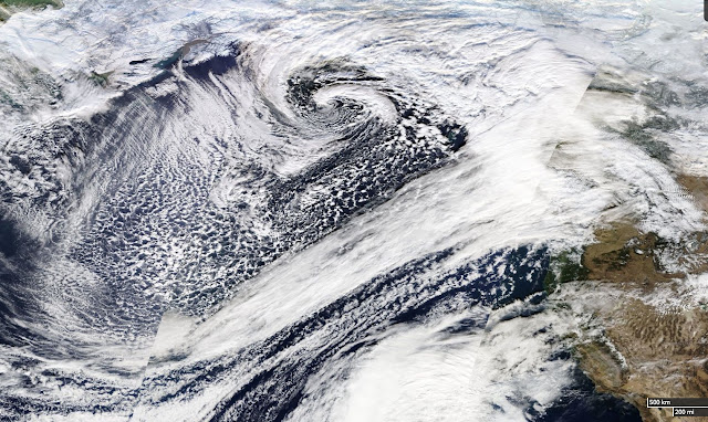
Want to see the process from space? Here is a NASA MODIS satellite image from Saturday over the north Pacific. You can see cold air streaming off of Asia to Alaska, produce lines of clouds resulting from the instability of cold air over warm water. This process results in warming of the lower atmosphere.


Interesting post... I have always wondered what our climate would be like if the Ocean temps were 5 or more degrees colder in the Gulf of Alaska. I love when a strong cold front moves in from the NW in the winter and snow levels plummet below 1000'. I bet back in the 1700-1800's ocean temps were colder which resulted in a much more snow locally. Either that or the arctic was much colder which resulted in an overall lower mean snow level.
ReplyDeleteIt's nice to see one of those ocean temp maps with the scale done in more than red and yellow.
ReplyDeleteThe only forecaster in Portland who predicted at least three major snow events last winter (there were more, in fact), is calling for a similar forecast this winter. The region wasn't ready for it last winter, and they've chosen to bury their heads in the sand again for this season. Sheesh.
ReplyDeleteCliff,
ReplyDeleteThanks again for all of your work educating the public. Sorry, but I don't know of any other way to tell you that some rendering issue has appeared in your blog. In Chrome, I see fig.3 and 4 are scaled a bit big, overwriting the fine vertical line. More significantly, the last figure is scaled so big that the iPhone app overlays it some. The Firefox browser renders identically, and both browsers are updated.
Of course, I would not expect to see this note posted in comments.
The glaciers in Glacier Bay National Park (just northwest of Juneau) were all the way out into Icy Straits when the first Europeans came by near the end of the 18th century. Now they are 40+ miles back up into the various arms of Glacier Bay.
ReplyDeleteThe glaciers retreated all through the 19th century and were well back from the Strait by the start of the 20th century and have continued their retreat.
I think the cause of the glacial growth in the 18th century was the so-called Little Ice Age that ended in the 18th century, but I have no actual knowledge what that meant for ocean temps in the Gulf of Alaska, but one would presume temps were lower. It was definitely colder with vastly more accumulation in the mountains just north of Glacier Bay to make the glaciers grow like that, which meant Icy Straits really lived up to its name back then.
But here's the bright side, if you like classical music: "The violin maker Antonio Stradivari produced his instruments during the Little Ice Age. The colder climate is proposed to have caused the wood used in his violins to be denser than in warmer periods, contributing to the tone of his instruments."
Interesting! I grew up in Kansas and Oklahoma where a cold front always brings an immediate refreshing 20 degree drop after the thunderstorm. When I moved up here I was puzzled by "cold fronts" that included wind but didn't cool things off. Now I know why! Thanks.
ReplyDeleteRegarding Bob Stafford's comment, the final image is a .tiff (Tagged Image File Format), not the usual .gif or .jpg
ReplyDeleteI suspect the page-formatting system doesn't know how to deal with a tiff, so it set the column width to that of the widest .gif (the temperature aloft chart).
Since the tiff was wider, it spread into the right column.
Whether or not the iPhone app 'advertisement' got stepped on is/was dependent upon if the archive drop-list was short or long.
What you're seeing is also happening on Microsoft's Edge browser as well as Firefox, so I'm pretty sure that it's a page-creation issue, not a browser-incompatibility issue.
Anyone who wants to see upper weather happen "real time" is welcome to go to a web page I recently put up (disclaimer: it requires a desktop computer so will not work on a smart phone):
ReplyDeletehttp://koosah.info/mm_obs_demo_v2.html
Each dot represents an observation taken by a commercial aircraft (the dots are color coded by altitude, green means low, red means high). Hover the mouse pointer over the dots to get the details of the observation. It's an interactive, zoomable map. Only displays data for the Seattle area because that's where the only radio receiver feeding data into it currently is.
The airlines share this data with the NWS, but the NWS does not release it to the general public because the airlines made the NWS promise not to in return for sharing it. I'm getting around that by grabbing the data off the air.